I had spent a few days building a demonstration of what I am capable of using HTML, CSS and JavaScript. The next step was to show it off! So after hosting it using GitHub pages it was time to share it around in as many places as possible in the hope of it being noticed.
But there was one problem… when I shared it on my LinkedIn profile, front and centre in the “Featured” section, the thumbnail was a bland and generic grey rectangle. That’s no good. How do I fix this? Is there a setting somewhere? Can I upload a decent one?
I found the answer the way any good web developer does and hit the search engines, which actually brought me back to an article on LinkedIn, so a shout out to Nigel Cliffe and his article.
What it taught me was that I needed to go back to my index.html and add a new <meta/> tag with a property of og:image. What this does is tell sites like LinkedIn and Facebook what particular images they need to render for a shared link. So I went ahead and added the image I wanted to my repository’s ./public/images folder and went to add the needed <meta/> tag to the <head><head/> of the index.html.
With the meta tag you will need to set property=“og:image” and content="<url to your image>". Following that it is best practice to also include 2 more <meta/> tags. The first with property=“og:image:width” and content="<the image's width in pixels>" and the second with property=“og:image:height” and content="<the image's height in pixels>". Theses will allow sites to render the image quickly, thus providing maximum impact when potential reads are scrolling.
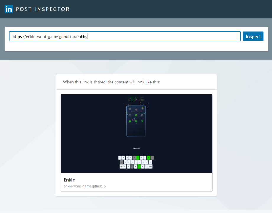
When these are added you can use the LinkedIn Post Inspector to see how it would look as a shared link.
Now my feature page has a far more attractive thumbnail for the link I’m most proud of! Make sure you’re also maximizing these great free tools to show off what you can do!